We've now released the updated charts and options within the results summary to all users.
You can now access new chart functionality that enables you to create several types of chart and change display options within your survey results summary to support with your analysis and reporting.
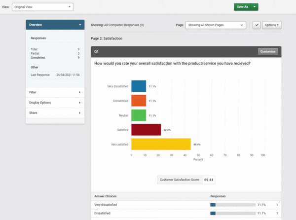
Depending on your plan you'll be able to access a selection of the charts and options highlighted below. If you're on our Business plans and above, you'll be able to save your charts within your view or create multiple views so that you can easily access and analyse different areas of your survey results in future.

Charts available include:
- Bar
- Column
- Line
- Area
- Pie
- Stacked bar / column
- Net Promoter Score (NPS) Gauge
- Customer Effort Score (CES) Gauge
- Customer Satisfaction Score (CSAT) Gauge
Display options include:
- Edit question text
- Edit question labels
- Turn chart colours on/off
- Turn legend on/off
- Show/hide tooltip
- Edit decimal places
- Hide answers with '0' responses
- Show/hide response breakdown
Please let us know your feedback and suggestions for future updates. We'll continue to release additional charts and options over the next few months.
Links
- To find out more about how to use new charts options visit our help guides
Get started and create your first survey


