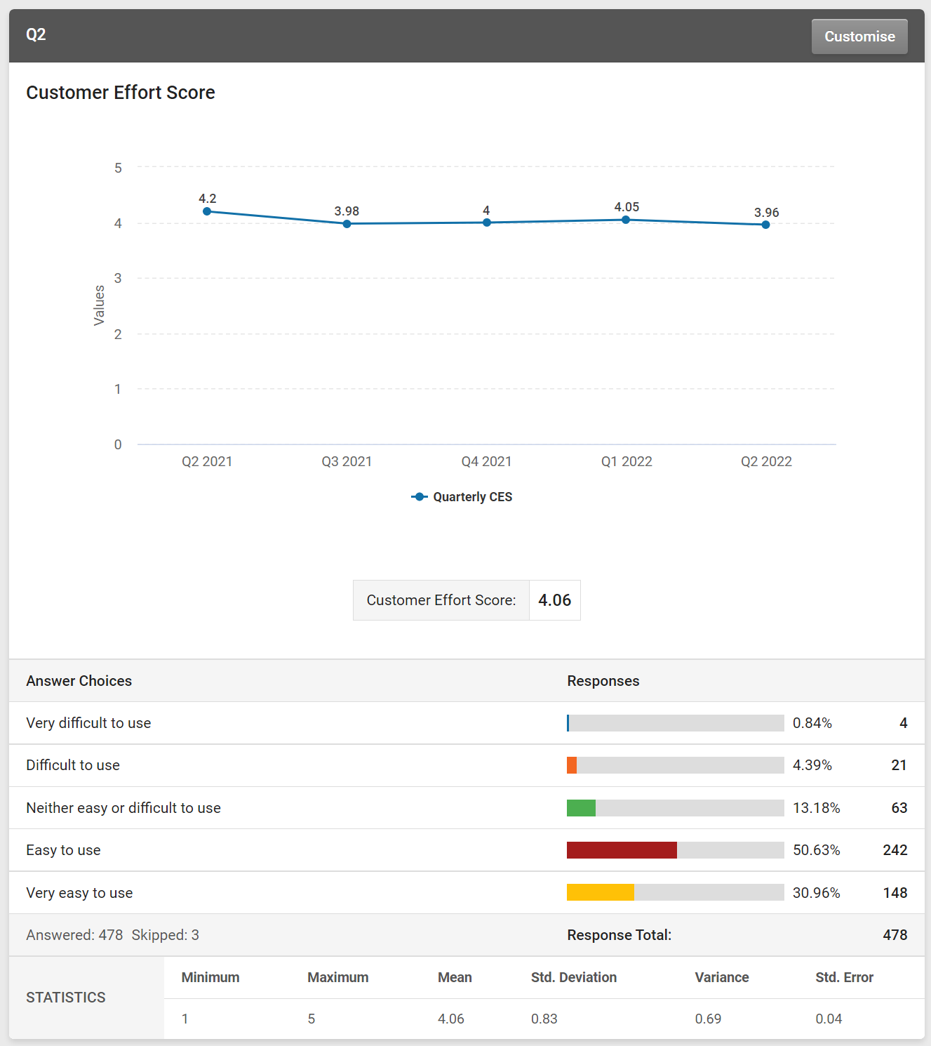
We've released a new chart type for the Customer Effort Score (CES) and Customer Satisfaction Score (CSAT) questions. You can now view your CES & CSAT scores over time with a trend chart.
Using the results summary filter, you can select the time period for your chart data, which will be reflected across your whole results view. You can then change how much data you show within the chart, choosing from years, quarters, months, weeks or days using the "Trend By" menu.
Depending on how you choose to show your data, the chart will calculate the CES or CSAT score for each data point and show the total score for the time period below the chart.
By measuring how easy and satisfying your customers found interacting with your brand, product or service at different touchpoints over time, the CES and CSAT score metrics are the best for measuring and improving your customer experience.
You can include your Trend charts in your shared results views and exports, enabling your teams to monitor key metrics.
Links
Elevate your survey game.
Discover the power of our cutting-edge survey software with a personalised demo!


